Wednesday, July 15, 2009

KLCI broke above its short-term downtrend

The continued rise in Asian stock markets today raises our hope that the current correction may be coming to an end. Let's start with KLCI.

Our KLCI tested its short-term downtrend line at 1080 yesterday. It broke above that downtrend line today after gaining 10.5 points to close the morning session at 1090. With this breakout, the downside risk of our market has now reduced considerably. While not promising an immediate uptrend, this breakout would likely to be followed by a sideway market (instead of a down-trending market) at the very least.


Chart 1: KLCI's daily chart as at July 15, 2009_at 12.30 noon (Source: Quickchart)

Besides KLCI, the AORD may have broken above its short-term downtrend line resistance at 3860. AORD is now at 3917. STI is closing in on its short-term downtrend line, with resistance at 2350. STI closed the morning session at 2344.


Chart 2: AORD & NIKK's daily chart as at July 14, 2009 (Source: Stockcharts.com)


Chart 3: TWII & STI's daily chart as at July 14, 2009 (Source: Stockcharts.com)


Chart 4: BSE & NIKK's daily chart as at July 14, 2009 (Source: Stockcharts.com)

The recovery in our KLCI may have been aided by the recent change in the component stocks of the KLCI. In fact, the KLCI as it's known today is not the same as the old KLCI. The latter is a 100-stock index while the current one is a 30-stock index. Its full name is FTSE Bursa Malaysia KLCI & it adopted the acronym of old index, KLCI. Two of the biggest beneficiaries of this exercise is Public Bank & Commerce. With increased weightage in the main index, Public Bank & Commerce enjoyed additional flow of investment funds which sent their share price higher. The sharp run-up in their share price has in turn boost the KLCI.

PS- As at 4.45 pm, DAX & FTSE have broken above their short-term downtrend line, with resistance at 4800 & 4260, respectively. DAX & FTSE are presently at 4852 & 4285, respectively.

Tuesday, July 14, 2009

Gain exposure in Crude Oil & Gold via USO-C1 & GLD-C1

Recently, OSK issued 2 interesting CWs which would enable investors to gain an exposure to the play on Crude Oil & Gold. You may want to do so if you believe that the economic recovery is slowly gaining traction & this will lead to increase in the price of Crude Oil due to higher demand. A reasonably strong recovery will lead to an inflationary environment where the price of Gold is likely to move higher.

Even if you have this outlook, you have to consider what will be the best vehicle to use. In the case of Gold, you can consider physical gold (eg. coin), gold futures, gold mining stocks or gold ETFs (eg. GLD). For Crude Oil, you have a choice of crude oil futures, oil stocks or crude oil ETFs (eg. USO). To use CWs to gain exposure is a medium-high risk speculation.

I have tabulated the main terms of USO-C1 & GLD-C1 below. Due to the recent sharp correction in Crude Oil (WTIC) & USO, the premium for USO-C1 has widened from 23% at the time of issuance to 39% now as the price of USO-C1 has yet to adjust downwards. You should wait for some correction in USO-C1 (or some recovery in USO or WTIC) before buying. On the other hand, Gold prices did not drop very much since the listing of GLD-C1. This plus the drop in the price of GLD-C1 led to an improvement in the premium of GLD-C1 from 19% at the time of issuance to only 15% now. Is this an acceptable premium in an environment where risk aversion is slowly gaining a foothold? I am not sure.


Table: Main Terms of USO-C1 & GLD-C1

I have appended the charts of WTIC & USO as well as Gold & GLD for your quick reference.


Chart 1: USO's daily chart as at July 13, 2009 (Source: Stockcharts.com)


Chart 2: WTIC's daily chart as at July 13, 2009 (Source: Stockcharts.com)


Chart 3: GLD's daily chart as at July 13, 2009 (Source: Stockcharts.com)


Chart 4: Gold's daily chart as at July 13, 2009 (Source: Kitco.com)

A strong rebound that changes little

Wall Street has a strong rebound yesterday. From the two charts below, we can see that DJIA & S&P500 have crossed above their respective necklines. Despite the recovery, the initial breakdown below the neckline last week was sufficient to satisfy the minimum requirement of a short-term downtrend, i.e. a lower 'high' & a lower 'low'. What we can hope for is that yesterday's rebound & hopefully further recovery ahead can override this short-term downtrend. The first objective will be to take out the 20-day SMA & 50-day SMA. Since S&P500 closed at 901 yesterday, its 20-day SMA & 50-day SMA are within reach at 905 & 911, respectively. Similarly, DJIA which closed at 8332 could challenge its 20-day SMA & 50-day SMA at 8384 & 8463, respectively. Can they do it?


Chart 1: DJIA's daily chart as at July 13, 2009 (Source: Stockcharts.com)


Chart 2: S&P500's daily chart as at July 13, 2009 (Source: Stockcharts.com)

Note: The break below the neckline of the Head-&-Shoulder formation for both DJIA & S&P500 last week were not accompanied by increased volume. The absence of an increase in volume raised some doubt as to whether we had witnessed a genuine reversal. Since the faster 20-day SMA has already crossed below the 50-day SMA, we can take the reversal as confirmed but unaccompanied by volume. If I may draw an analogy to a scene in a crowded pub where someone has just shouted "FIRE" and only a handful of patrons rushed out. If it is a false alarm, the same handful of patrons would walk back in, looking foolish. If it is a real fire, there would be a mad rush for the door later. So, which is it?

Monday, July 13, 2009

The house of BRIC is crumbling

Shanghai's SSEC is the last stock market in a BRIC economy to be still standing. BRIC-- the acronym given by Goldman Sachs in 2001 to the fast-growing developing economies of Brazil, Russia, India & China-- is the mighty little red caboose that the world is pinning the hope of restarting the stalled global economy, in place of the derailed locomotive of the developed economies of US, Europe and Japan. However there are signs that the strain is to much for the BRIC economies to handle. Except for Shanghai's SSEC, all the stock markets of the other BRIC economies have entered into correction. See Chart 1 & 2 below,


Chart 1: SSEC & RTSI's daily chart as at July 10, 2009 (Source: Stockcharts.com)


Chart 2: BSE & BVSP's daily chart as at July 10, 2009 (Source: Stockcharts.com)

How much longer can SSEC power on? It has broken above the strong horizontal line resistance of 3000 in early July. In the past few days, its rise has been capped at 3140-50. Its next strong horizontal line resistance is at 3750-3800. See Chart 3 below.


Chart 3: SSEC's weekly chart as at July 10, 2009 (Source: Stockcharts.com)

A correction may start for SSEC, if one of the following occurred:
1) a drop in the SSEC index below the psychological support of 3000; or
2) a drop in the SSEC index below the 20-day SMA line (presently at 2970); or
2) the MACD or RSI indicator breaking below their respective uptrend line (black line). See Chart 4 below.


Chart 4: SSEC's daily chart as at July 10, 2009 (Source: Stockcharts.com)

If SSEC were to enter into a correction, the current cautious selldown in the emerging equity market could take a turn for the worst.

Friday, July 10, 2009

Nestle M- time to take profit

Background

Nestle (M) Bhd ('Nestle M') manufactures and markets more than 300 products in Malaysia. Its brand name such has MILO, NESCAFÉ, MAGGI, NESPRAY and KIT KAT are household names and enjoyed for generations. For more on Nestle (M), go here.

Nestle M is 72.6%-owned by Nestle SA.

Recent Financial Results

In its latest available quarterly result, Nestle M's net profit increased by 29.9% q-o-q or 6.4% y-o-y to RM100.4 million while turnover increased by 1.2% q-o-q or 6.1% y-o-y to RM984 million. The 8 quarterly results are shown below in table form & chart form.


Table 1: Nestle M's 8-quarterly results


Chart 1: Nestle M's past 8 quarterly results

Technical Outlook

Since its listing in 1990, Nestle M's share price has been rising. One can draw an upward channel to envelope the share price movement (see Chart 2). It is now at the upper boundary of that channel, with a potential upside of RM33.00. To rise to that level, Nestle M will have to make a new high. It is presently sitting at the all-time high of RM32.00- the third trip to this level in the past 2 years. Will it surpass the all-time high? Or, are we looking at a potential reversal in the form of a triple top? This game of brinkmanship has been going on for 3 weeks, since June 12 (see Chart 3).


Chart 1: Nestle M's daily chart for the past 19 years (Source: Tradesignum)


Chart 2: Nestle M's daily chart as at July 9, 2009 (Source: Quickchart)

Valuation

Nestle M (closed at RM32.00 yesterday) is now trading at a trailing PE of 22 times (based on last 4 quarters' EPS of 148 sen). Many own this stock for its dividend but its dividend yield is only 4.1%. Nestle's dividend payout for the past 5 years are 100.9 sen (FY2004); 106.49 sen (FY2005); 229.07 sen (FY2006); 215.64 sen (FY2007); and 130 sen (FY2008). The dividend payout for FY2007 includes a special dividend of 61.2 sen that was announced together with the 1Q2008 results. I do not think there will be any special dividend for FY2008 since the company was silence when it announced results for 1Q2009 in mid-April.

Comparison with Nestle SA

I have appended below the chart of Nestle SA and a chart comparing its share price movement with other giant foods companies (Kraft Food, Unilever & Groupe Danone). We can see that Nestle SA made a high of about CHF55 in December 2007 & corrected back in 2008. Some recovery in the share price was seen in the past few months for all 4 companies. One would be very surprise by this timid rebound among the global food giant when compared to the stunning rise of our Nestle M.


Chart 4: Nestle SA's 5 years chart


Chart 5: Nestle & 3 other giant food companies' chart for past 5 years

Nestle SA closed at CHF41.14 yesterday. From the financial overview below, we can see that Nestle SA's EPS for FY2008 was about CHF2.82. Thus, its trailing PE is about 14.6 times only.


Table 2: Nestle SA's Financial Overview for FY2008 & FY2007

Conclusion

Based on the above, Nestle SA is a cheaper stock than Nestle M. In addition, the parent's share price has corrected somewhat while Nestle M is trading at its all-time high. Even if Nestle M can break above the all-time high of RM32.00, its rise may be capped by the upper boundary of the channel at RM33.00. As such, it may be a good idea to slowly take profit on Nestle M.

Thursday, July 09, 2009

Some unpleasant news

Readers of this blog are aware that I am cautiously optimistic about the outlook of the stock market & the economy. My take is that the economy has seen the worst & we may see some growth in later part of the year or early part of next year. The stock market- being a barometer of the economy- should recover earlier and that's what we saw in the past 3-4 months. The current correction is taking place in an over-bought market and is deemed healthy.

However, there are signs that the recovery may be running into trouble. The market was taken by surprise in early July when the US' unemployment rate jumped to a 26-year high of 9.5 per cent, with another 467,000 people losing their jobs in June. Most economists now believe it will top 10 per cent before the end of the year. Some 14.7 million people are now looking for work in US.

Firstly, we shall look at the charts of crude oil prices (WTIC) & freight rates (BDI). Increased economic activities & trades will drive up BDI & WTIC. We can see that BDI started to recover in early January while WTIC recovered in early March. These were immediately followed by a recovery in DJIA in the middle of March. Now, the picture is getting cloudier- BDI has broken below its 20-day SMA & WTIC has just broken below its 50-day SMA. Are we seeing a mild slowdown or something worse?


Chart 1 : DJIA, WTIC & BDI- 18 months to July 2009 (Source: Stockcharts.com & Investment Tools)

The second thing that we must look out for is the movement of the 10-year Treasury yield (TNX). If the economy is about to pick up & is flushed with liquidity, the bond market will signal its concern about a potential rise in inflation rate by selling down Treasury bond which automatically pushed up the yield. However, bond traders will do the reverse once the economy recovery shows sign of weakening. We can see both actions in end 2002 & middle of 2003, where the TNX crossed above the 10-month SMA & then dropped below the same line (the yellow & red vertical lines). You will note that in May this year, TNX crossed above the 10-month SMA and went as high as 4%. It is now dropping back very sharply & would likely to test the 10-month SMA line at 3.0-3.1% soon. It has already broken below the strong horizontal support area of around 3.5%.


Chart 2: S&P500 & TNX- 10 years to July 2009 (Source: The Technical Take)

From this article, you may have a better understanding of the bearish factors affecting the markets today. I have appended below the links to a few articles that take a rather grim view of the current economic situation. They are:

1. 'The crisis is morphing again', by PIMCO's Mohamed El-Erian (from FT Alphaville)
2. 'The worst is yet to come', by IMF chief (from Malaysian Insider)
3. 'Expect new equity low in 2nd Half', by Societe Generale's Albert Edwards (from Zero Hedge)
4. 'We're Headed Right Back To The 1930s' by Paul Krugman (from Clusterstock)
5. Second Stimulus to be considered, from US presidential adviser Laura Tyson (from Bloomberg)

Wednesday, July 08, 2009

PPB- heading to all-time high?

Background

There are not many stocks that are about to make a new all-time high. One member of this exclusive club is PPB Group Bhd ('PPB'), is a diversified conglomerate involved in the following businesses:
- Foods
- Manufacturing & Services
- Entertainment
- Property Development
- Plantations And Edible Oils

Recent Financial Results

For 1Q2009 ended 31/3/2009, PPB's net profit dropped 25.2% q-o-q or 29.0% y-o-y to RM272 million while its turnover dropped 7.2% q-o-q or 4.5% y-o-y to RM772 million.


Valuation

PPB (closed at RM11.80 yesterday) is now trading at a trailing PE of 12 times (based on last 4 quarters' EPS of 99 sen) or at a Price to Book of 1.03 times (based on NTA per share of RM11.47 as at 31/3/2009). While a PE of 12 times looks like fair valuation for most stocks, PPB may be an exception. It is a blue chip conglomerate & the flagship of the Kuok group in Malaysia. For these exceptional quality & in this difficult economic environment, some may be prepared to pay a bit extra to own this blue chip.

Technical Outlook

PPB is in an upward channel where the upper & lower boundaries are presently at RM12.70 & RM11.20, respectively. To reach the upper boundary, PPB will have to surpass its all-time high of RM12.20. On July 6, the first attempt at the all-time high was made but it fell short when it reached RM12.10. We can expect further attempt in the days ahead. Will it be able to overcome the current all-time high? See Chart 1 & 2 below.


Chart 1: PPB's daily chart as at 7/7/2009 (Source: Quickcharts)


Chart 2: PPB's weekly chart as at 7/7/2009 (Source: Quickcharts)

Potentially negative scenario examined

I have appended a 22-year chart of PPB from 1987 until today. Using my own adaption of three-fan lines, we can see that PPB has been moving between these lines for the most part of the 22-year period until recently. The top & bottom lines acted as resistance & support for about 18-19 years until a bullish breakout happened in 2007. This could have been prompted by huge one-time gain of RM6.4 billion from the disposal of PPB Oil Palms, PGEO Group & Kuok Oils & Grains Pte Ltd. Whatever it is, the breakout was followed by an exponential rise from about RM6.50 to RM12.00.

From a technical perspective, PPB is now in a very precarious position. A test of the all-time (a fairly recent all-time high) could be a set-up for a double-top where PPB could potentially fail to surpass the RM12.20 high & the stock may subsequently enter into a corrective wave. Even if PPB can surpass the RM12.20 high, a subsequent retreat below the RM12.20 could also be a trigger for a sell-off (see a little-known rule called "Rule 2b"). Following technical rules, one may choose to reduce his/her position in this stock ahead of a test of the all-time high of RM12.20. He/she may sell more aggressively if the two scenarios as discussed above were to happen.

In October last year, PPB corrected sharply & found support at the top line of the three-fan lines at RM6.85. If a similar correction were to happen, it may again find support at this line, presently at RM7.00. That's cold comfort from where the stock is right now!

Note: I'm discussing a bearish scenario which may or may not happen. You will have to make this judgment call based on many factors, not just this scenario alone.
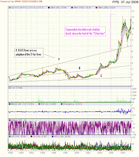

Chart 3: PPB's daily chart from 1987 to 7/7/2009 (Source: Tradesignum.com)

Conclusion

PPB will surely pitch the fundamental analyst against the technical analyst within all of us. I bring this perspective to you so that you are aware of the possibility of this stock.

Axiata may have a bullish breakout, again...

Despite a bearish market, Axiata appears to have just broken above its medium-term downtrend line at RM2.48. What could have prompted this move? There is a report in the Edge that Axiata Group Bhd is considering an offer for Millicom International Cellular SA’s assets in Cambodia and Sri Lanka, possibly bidding as much as US$500 million (RM1.77 billion) for Millicom’s stake in its Cambodian unit and US$200 million for the Sri Lankan operations (go here).


Chart: Axiata's daily chart as at 7/7/2009 (Source: Tradesignum.com)

This is the second time that I am pointing out the possibility of a bullish breakout above the medium-term downtrend line by Axiata. The earlier call was in May but that breakout quickly fizzled out. The difference between the two calls lies in the way the downtrend line was drawn. Take a look and you will see what I mean.

Ajiya's topline & bottomline rebounded

Background

Ajiya Bhd ('Ajiya') is mainly involved in the manufacture and supply of materials used in the construction and building based industries in Malaysia.

Recent Financial Results

Ajiya has just announced its results for 2Q2009 ended 31/5/2009. Its net profit increased 40.0% q-o-q to RM5.0 million on the back of a 13.2%-increase in turnover to RM80.2 million. Compared to the previous corresponding quarter i.e. 2Q2008, both net profit & turnover are lower by 22.2% & 0.5%, respectively.


Table: Ajiya's 8 quarterly results

I have appended below Ajiya's last 11 quarters' top-lien & bottom-line movement which shows the zig-zaggy rise in its turnover but profitability remained between the RM5-10 million mark.


Chart 1: Ajiya's 11-quarter top-line & bottom-line performance

Valuation

Ajiya (closed at RM1.26 yesterday) is now trading at a trailing PE of about 4.5 times (based on last 4 quarters' EPS of 28 sen). At this multiple, Ajiya's valuation is undemanding.

Technical Outlook

Ajiya has broken above its immediate downtrend line at RM1.20 in April. The long-term downtrend line for Ajiya still lies overhead, with resistance at RM1.50-55. Ajiya is likely to drift lower over the next few weeks as its MACD indicator has already hooked down. Good entry for Ajiya is at RM1.00-10.


Chart 2: Ajiya's weekly chart as at July 7, 2009 (source: Quickcharts)

Conclusion

Ajiya is an inexpensive building material stock which has bottomed out. It may benefit from construction projects to be carried out under the government's various fiscal stimulus package or the revival of the property sector, further down the road.

Tuesday, July 07, 2009

Where is the correction in Plantation stocks?

In April & May, we have noted that CPO was showing signs of weakness near its recent peak at RM2800 (here & here). Since then, CPO has corrected to the RM2100-2200 support level. The support is provided by the short-term uptrend line (currently at RM2150) and the overcome medium-term downtrend line (currently at RM2080). If these two supports failed, CPO can test the horizontal line support of RM2000.


Chart 1: CPO's weekly chart as at July 6, 2009 (source: ifs.marketcenter.com)

Despite CPO dropping about 25% from its peak, the Plantation index has experienced only a mild correction (see Chart 2 below). Part of the reason could be that plantation companies may not suffer too badly as the decline in CPO prices would be offset by increase in their output. I have tabulated the FFB output for IOI for the past 12 months & we can see that its monthly FFB output are sharply higher for the period from July to November (see Chart 3 below). Looking at the Plantation index, we can see some weaknesses in the MACD, Williams %R & ADX indicators. If the Plantation index were to weaken further, it may test its medium-term uptrend line support at 5000 mark.


Chart 2: Plantation's daily chart as at July 6, 2009 (Source: Quickchart)


Chart 3: IOI's 12-month FFB Output Jun-08 to May-09 (in thousand metric tons)

In the recent past (say, in 2007), CPO moved in tandem with Crude Oil. Some may think that the close correlation may have weakened. The correlation may be stronger if Crude oil is above USD60-70, the threshold for profitable bio-diesel operation. In any event, Crude oil has also entered its corrective phase- one month later than CPO. We can see below that WTIC may soon test its medium-term uptrend line support at USD62. I have earlier posted about the possibility of a correction in Crude oil (here). I still believe the current uptrend would remain intact.


Chart 4: WTIC's daily chart as at 6/7/2009 (Source: Stockcharts.com)

Based on the above, I expect plantation stocks to remain resilient. Correction, if any, is likely to be mild (say, 10%). If CPO remained above RM2000 & Plantation index remained above 5000, we may slowly accumulate some plantation stocks that have corrected.

Integrax- error noted in earlier post

On June 26, I've posted that Integrax may benefit from the setting up of an iron ore pelletizing plant in Manjung, Perak. To wit, Vale International SA, the world’s second largest diversified metals and mining company, has agreed to buy 165.5ha in Manjung, Perak, from property developer KYM Holdings Bhd. In addition, Vale had an option to buy another 305.95ha, putting the total amount of land available to Vale at 471.46ha in Manjung. It has plans to invest RM9bil in an iron ore pelletizing plant on the site. Pelletizing of iron ore is the process of converting the raw ore into pellets with characteristics appropriate for use in a blast furnace. If this plant takes off, the importation of iron ore to the plant will likely to benefit Integrax's existing 2 port facilities- Lumut Maritime Terminal & Lumut Bulk Terminal- significantly.

The above highlighted statement is incorrect. It seems that the whole project encompasses a private jetty, where the raw iron ore that Vale would be importing (and, the pellets that it could be exporting/shipping out) would pass through. However, all is not lost. I expect the increased electricity consumption would result in more coal shipment being imported by Malakoff's Lumut power plant and all coal shipments pass through one of its port. This error was first pointed by by a reader (hat tip to KLSE). The same information also appeared in a recent article entitled "Possible boon for Integrax" in the Edge newsletter.

KLCI may benefit from the strengthening of RM vis-a-vis USD

The anticipated recovery in the US dollar looks unlikely with each passing day. Renewed fear of risk aversion over the past 2-3 weeks did not give any boost to the US dollar. This is mainly due to the concern about rising US fiscal deficit & deteriorating financial position as well as loud haggling by foreign central banks (Chinese central bank, in particular) who are holding onto too much US Treasury bonds.

From Chart 1, we can see that USD index has stalled at the 80 point level for the past 1 month. Its immediate resistance will come from the downward sloping 50-day SMA at 81.4 as well as the upper boundary of the downward channel at 82.5-83.0.


Chart 1: USD's daily chart as at 6/7/2009 (Source: Stockcharts)

The rising concern for the value of US dollar has boosted the value of the ringgit (RM). From Chart 2 below, we can see that the uptrend of the USD-RM cross rate has peaked & a potential Head-&-Shoulder reversal is nearly at hand. The neckline of this H-&-S formation is at the 3.47-48 level.


Chart 2: USD index's daily chart as at 6/7/2009 (Source: Yahoo Finance)

In the past, we have noted the inverse correlation between the KLCI and the movement of USD-RM cross rate (see Chart 3 below). This means that the KLCI could benefit from further weakening of the US dollar.


Chart 3: KLCI & USD-RM cross rate's daily chart as at 6/7/2009 (Source: Quickcharts/Yahoo Finance)

US & European markets hanging by their neckline

US & European markets are hanging onto their crucial support level. As noted in an earlier post, DJIA, S&P500, DAX & CAC40 are all coming to the important neckline of their respective Head-&-Shoulders formation. DAX & CAC40 broke their neckline & staged a late recovery but closed marginally below their neckline (see Chart 1 below). DJIA & S&P500 broke/tested their neckline, staged a late recovery and closed above their neckline (see Chart 2 below). These markets may recover further or they may re-test & go below their neckline again over the next few days.


Chart 1: CAC40 & DAX's daily chart as at July 6, 2009 (Source: Stockcharts.com)


Chart 2: DJIA & S&P500's daily chart as at July 6, 2009 (Source: Stockcharts.com)

Monday, July 06, 2009

Market Outlook as at July 6, 2009

This morning, the KLCI made a low of 1063 at about 10.45am. From Chart 1 below, we can see that the 20-day SMA support at 1062 has kicked in- giving the KLCI a small lift. The 20-day SMA may be tested again over the next few days. If the KLCI were to break below this support, then it may fall back on the 50-day SMA at 1031 or even the 100-day SMA at 1006.


Chart 1: KLCI's daily chart as at 6/7/2009_9.30am (Source: Quickcharts)

I believe the KLCI is now tracing out Wave C of a A-B-C Corrective Wave pattern according to Elliot Wave theory. You can go here to read more on Elliot Wave theory. Under this theory, the corrective waves may come in many forms (go here) and upon its completion, the next upleg will commence. So, if I assumed that the current correction is a simple, zig-zag A-B-C Corrective Wave pattern, I may be able to predict the termination of Wave C. For a clear picture of this pattern, see Chart2 below.

Under a simple, zig-zag A-B-C Corrective Wave pattern, Wave C is about equal to Wave A, in term of distance. Wave A is about 67 points (1095 less 1028). So, Wave C will be about 1015 (1082 less 67).


Chart 2: Simple, zig-zag Corrective Waves pattern (Source: Babypips.com)

The projected termination of Wave C is just slightly above the 20-week & 50-week SMA of about 1005-1012. On June 16 (here), I have posted that the KLCI might undergo a correction that's the opposite of what happened in April-May 2008 (which was a bear rally). To reach this depressed level, the KLCI would have to break below the 80-week SMA, presently at 1048.


Chart 3: KLCI's weekly chart as at 6/7/2009_9.30am (Source: Quickcharts)

The current deluge of negative news flow would keep the pressure on the market. This could send the KLCI lower, possibly to the 1000-1020 level. As long as the 1000 level is not violated, the long-term technical outlook would remain positive.

Friday, July 03, 2009

Should we fear the secular bear?

In March, I've posted that the US stock market is now a secular bear market (go here). Yesterday, I came cross this post in the Big Picture about the S&P500 monthly chart (adjusted for inflation) over the last 140 years. The chart was sourced from The Chart Store.


Chart: S&P500 monthly chart (adjusted for inflation) for the past 140 years

My observations:
1) The peak-to-trough decline for the past 3 secular bears range from 66% to 70%, with the average of 68%. Assuming that the recent trough of 670 (recorded in March 2009) is the bottom for the current secular bear, the drop from the peak to the trough is about 65%. That's about equal to the average decline in the past 3 secular bears.
2) In the past 3 secular bears, the peak-to-trough took 165-238 months, with average of 191 months. The current secular bear dated back to March 2000. Assuming that the recent trough of 670 (recorded in March 2009) is the bottom for this secular bear, then the peak-to-trough took only 108 months. This means that the current secular bear could be the briefest secular bear, if the recent trough of 670 is the bottom for this secular bear. The next briefest secular bear is the 1968-82 which lasted 165 months.
3)In the past 3 cycles, the time that S&P500 took to return to the peak of the preceding secular bull is about 263-350 months, with the average of 301 months. Historically, the secular bull overshot the peak of the preceding secular bull.

Assuming the March low of 670 is the bottom of this secular bear, the average duration the S&P500 may take to go back to the 2000 peak would be about 110 months [i.e. the average of (3) less the average of (2)]. So, in about 10 years time, the S&P500 may return to its 2000 high of 1940 from its March 2009 low of 670- giving an attractive non-compounded return of 18-19% per annum. To me, that's a good case why one should look at equity investment, when the time is right.

US & European markets at a crossroad

Yesterday, US & European markets dropped very sharply. The major losers are CAC40 (-3.13%); DAX (-3.81%); FTSE100 (-2.45%); DJIA (-2.91%); and S&P500 (-2.63%). The recent uptrend in these markets may have ended. In 3 of these markets, the 20-day SMA is poised to cut below the 50-day SMA (CAC40, DAX & FTSE100). In 4 of these markets, Head-&-Shoulders formations are sighted but their neckline support are still intact (DJIA, S&P500, DAX & CAC40). If these markets can rebound off the neckline support, then they are likely to resume their prior uptrend. However, if the neckline is violated, then the recent uptrend would have ended with a reversal and we are likely to see the start of a downtrend in the market. The next few days will be very crucial for these markets.


Chart 1: DJIA's daily chart as at July 2, 2009 (Source: Stockcharts.com)


Chart 2: S&P500's daily chart as at July 2, 2009 (Source: Stockcharts.com)


Chart 3: DAX's daily chart as at July 2, 2009 (Source: Stockcharts.com)


Chart 4: CAC40's daily chart as at July 2, 2009 (Source: Stockcharts.com)


Chart 5: FTSE100's daily chart as at July 2, 2009 (Source: Stockcharts.com)

While most Asian stock markets look healthier than their Western counterpart, I believe they would follow the direction set by the US & European markets in the weeks ahead.

PS- You may notice that the 100-day SMA lies about 3-4% below the current level in all 5 markets. While it would be expected to act as a support in a falling market, I hope that it could also perform the role as the second defensive line in the event the neckline of the H-&-S formation were to fall. In such a scenario, I hope that the market would rally off the 100-day SMA & regain its position above the neckline.

Thursday, July 02, 2009

Commodity hoarding & US Dollars dumping

In a recent article entitled "The Phantom Commodity Bull Market & the Consequences", Financial Ninja examined the connection between the "new commodity Bull market" & the "China growth story". The increased Chinese demand could not have accounted for the tremendous growth in the importation of certain basic material. It posits that the huge increase in the volume of import can only be due to one reason: the Chinese are hoarding!

Similar tread was posted by Macro Man in an article entitled "The Chinese Syndrome":
"Drilling down beneath the surface, however, we see a picture that is much less unequivocally bullish for commodities. While overall imports have barely started to recover in value terms, many commodity imports have absolutely skyrocketed in volume terms. And at the end of the day, the inputs to China's industrial and investment complex are based on volume, not value.

Macro Man ran a study looking at the import volume of four different industrial commodities, comparing it with the trend of 2003 through mid-2008, a period in which Chinese growth averaged 11%. (Data for coal imports only begins in December 2004.) The results were remarkable."


In a separate article entitled "China, cleverly dumping US Dollars", Financial Ninja explained the rationale behind the Chinese's decision to hoard commodities:
"Well, imagine you had a bunch of money... err... US dollars for example. You've also got a bunch more of these US dollars coming in daily. You don't believe they will hold their value. So you don't really want them. That is quite a problem.

The first trick is to get rid of them... without actually seeming to get rid of them. The second trick is to get rid of them in such as way as to not destroy their value.... yet.

The single best way to do this of course is to use your US dollars to buy hard assets. This looks "normal". It isn't nearly as obvious as "diversifying" your currency reserves. China is doing exactly that."

Sadly, all good things must come to an end, sooner or latter. A key Chinese state planning official has signaled a halt to government buying of copper, aluminium and other high-value metals because prices have risen too high, as reported in the Sydney Morning Herald. Yu Dongming, the head of the metallurgical department of the National Development and Reform Commission was quotes as saying : "We don't anticipate that the country will continue to build its reserves".

Zhang Bin, an economist with the Government's most influential advisers, the Chinese Academy of Social Sciences, warned that Beijing was leaning against Chinese speculative buying of a range of commodities including Australia's most lucrative exports, coal and iron ore.

"The commission is acting to reduce pressure on commodities prices and discourage over-production in heavy industry, including guiding steel production and reducing the building of excess capacity," Dr Zhang told the Herald.

"Too much increase in inventories of commodities is not a good thing because the economy is still not that strong and cannot consume this level of imports of iron ore and coal."

In a post-crisis world where things are not always what's they seem to be-- commodity bull markets driven by Chinese hoarding & equity bull markets driven by ample liquidity-- how does one make a case for the green shots of economic recovery?

Wednesday, July 01, 2009

F&N secured a 20-month extension of its Coca-Cola bottling & distribution business

Talk about poor timing! One day after I posted on the F&N's stealthy rally in the past 2 months & proposing a trading SELL on the stock at RM10.00-10.40, the company announced the following:

1) it has entered into a Transition Agreement with Coca-Cola on 30 June 2009, which will take effect from the expiry of the Bottler’s/Distributor’s Agreements on 26 January 2010 for another 20 months until 30 September 2011, with some modification of terms. This will extend F&N's bottling & distribution of Coca-Cola products by another 20 months.
2) pursuant to (1) above, it has agreed to purchase additional 10% equity interest in F&NCC Beverages Sdn Bhd ("F&NCCB") and F&N Coca-Cola (Malaysia) Sdn Bhd ("F&NCC(M)")(both currently 90%-owned by F&N) for a total cash consideration of RM78.8 million. These 2 subsidiaries presently carry on the business of bottling & distributing Coca-Cola products.
For more on these announcement, go to here & here.

Notwithstanding the above, I believe that F&N is still a trading SELL at RM10.00-10.40. I expect a big jump in the price when the share is re-opened for trading. The stock is now suspended for trading.